Floor Plan Design Tips
For those who want to design the floor plan themselves, we prepared some tips based on our large floor plan design experience.
There's a guideline to keep in mind: we aim to guide users' attention in the right order. The priorities are as follows:
- Booths and other spaces
- Icons and text, including the legend, logo, event name, dates and venue
- Background objects. Coloring should follow this sequence, with booths being the brightest and the background being the least bright.
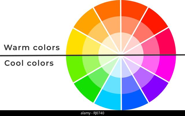
Also, it might help you to choose all colors in one palette: cool or warm, depending on what colors you see on the website and/or logo of the event.
Here is a picture to make you understand what cool & warm colors mean:
Here is what you should keep in mind:
Limited Palette: Stick to a palette of two colors.
Recognition is Key: Choose colors that make the event easily recognizable. Opt for standout colors beyond the basics (white, black, grey). Noteworthy choices include orange and beige.
Warmth in Harmony: Select warm colors like orange and beige as they complement each other and contribute to a harmonious appearance.
Avoiding Bright Extremes: Steer clear of extremely bright colors such as black, bright red, or acid colors to maintain a balanced visual experience.
Caution with Red: Refrain from using red for booths or other spaces, as it may appear similar on the view when clicking on a booth, potentially causing confusion among users.
Icons and text
Adding a white circle underneath icons typically highlights them, and they often look better this way, even if the difference is not too noticeable at first glance. The only exception to this rule might be columns or tables: they are not as important for navigation. We can choose the same color as the background outlines for them, so they won’t stand out too much.
The Entrance icon can be colored in bright colors. It is a significant point on any map, so we can use red, black, or acid colors.
FAQ
One of the main colors is red, what should I do?
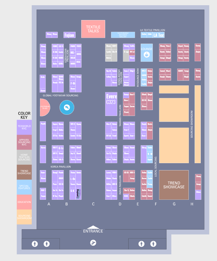
Avoid using it. Examine the website closely - are there any other colors you can utilize? You can apply this red color for the Entrance icon and incorporate it into their logo, but refrain from using it for booths and other spaces. While there are instances of red color use for other spaces, it's only acceptable if the color you used is sufficiently darkened or lightened. However, your primary focus should be on the website, and you might consider using gray as the main color or a different shade of the color used for booths. Additionally, avoid muddying colors by adding grayish hues; it's preferable to opt for "clean" colors.
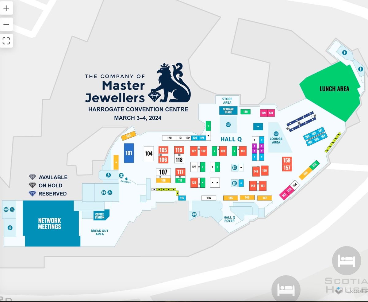
Here is an example of avoiding the usage of the red/orange color:
Also the example of adding grey to the color scheme to keep it clean:
As you can see, we still can use light red tints for the background parts!
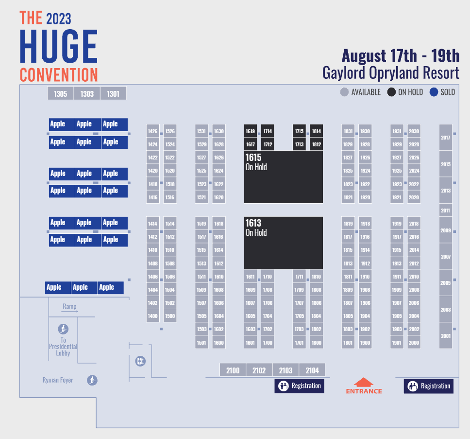
My background color is dark, help!
It is not a problem. You can follow the same rule about background outlines (30% darker) or color the outlines in white/light colors. Icons and text can be colored in white/light colors too. Remember to keep booths more noticeable than the bg you have.
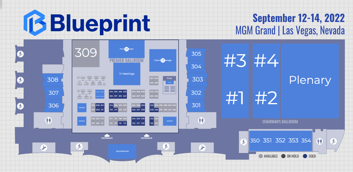
A few examples of the dark background:
Choosing colors is not an easy task; there can't be any strict rules. Evaluation is always subjective and may differ from one viewer to another. Never take negative comments about colors personally, as they do not define your skills and sense of aesthetics. Enjoy creating color schemes and have fun!