ServiceNow About ExpoFP Floor Plans: "Very useful for getting around"
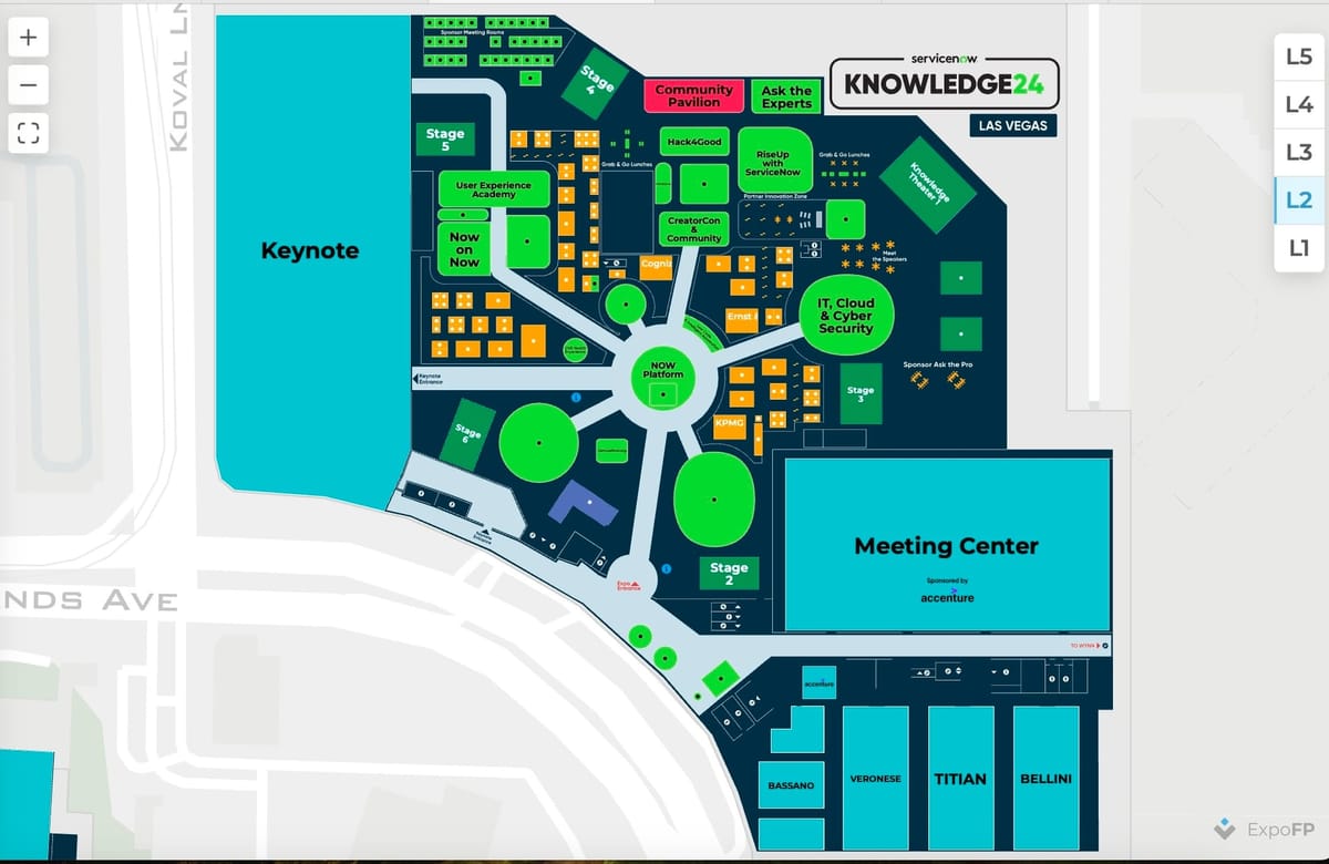
ServiceNow, a software company based in Santa Clara, California, specializes in creating cloud platforms to help businesses manage their digital workflows. For their annual user conference, Knowledge 2024 with 20000 attendees, held May 7-9 in Las Vegas at the Venetian Expo, ServiceNow needed a floor plan.
Our task was to create a five-level floor plan with a customized design to meet their specific needs. The floor plan included five levels and buildings, and a detailed layout for all key areas. To make navigation at the trade show easier, we used Crowd Connected blue dot wayfinding. The floor plans were displayed on Freeman's kiosks so that attendees could easily find their location on the show floor and quickly access the booths they needed.
Throughout the project, we made numerous adjustments based on client feedback to ensure the highest level of satisfaction. We removed the dates from all levels, changed the font throughout to Gilroy, and added or updated various labels and sections. For instance, on Level 1, we added a "Hot buffet lunches and Grab & Go" label to Hall G and included labels for "Bag Check" and "Lost & Found" based on the provided markup maps.
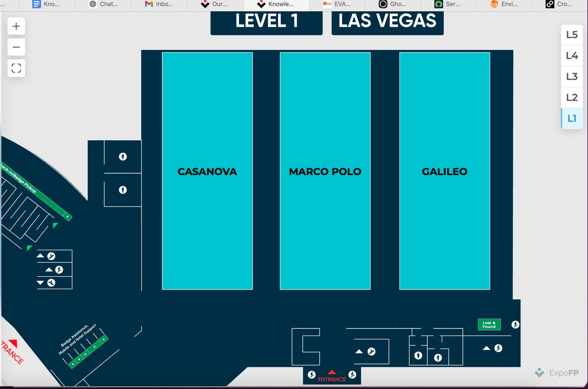
On Level 2, we implemented a color-coding system for different areas such as theaters and info desks, made certain areas clickable to provide additional information like hours of operation, and ensured key areas like the ServiceNow Store stood out with distinct colors.
At Level 3 we also made necessary changes to labels and placement of various areas, ensuring a seamless and intuitive experience for attendees.
And that was the feedback we received from Lauren Cunningham about our floor plans: "I loved the enhanced experience it provided for our attendees! Our attendees were able to easily search for a point of interest or location and navigate there without any trouble. It was also a great tool that provided increased visibility to our sponsors and partners, which was a great value-add. The additional integration into Crowd Connected was seamless and allowed for attendees to spend less time finding their way around and more time participating in the event. The tool was very easy to use from a front-end attendee perspective. The search functionality was simple and the customized branding reinforced key points of interest on the map for attendees. We also received very positive feedback from attendees, it was the highlight of our mobile app experience at our event this year. Our attendees found it very useful for getting around. The kiosk integration was also very helpful and well received as it was a great opportunity for attendees to stop and quickly find where they were going. Our exhibitors were also very happy with the tool and the visibility it gave them."
Our work on the Knowledge 2024 conference floor plan demonstrated our commitment to meeting clients' needs and requirements.
