
Exhibition Floor Plan Design: 12 Best Practices That Drive Traffic
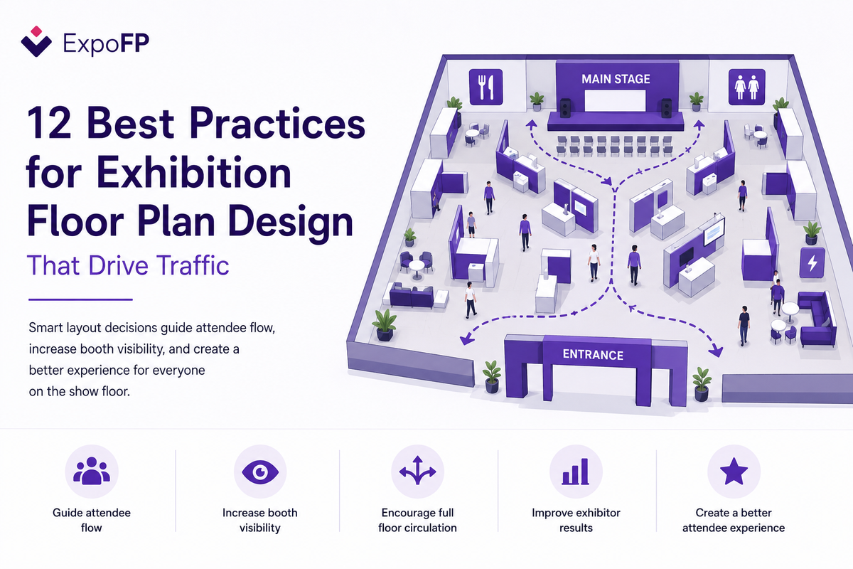
Good exhibition floor plan design starts with understanding how attendees will move through the space from the moment they enter. A well-planned exhibit hall layout uses clear entrances, appropriately sized aisles, strong sightlines, and effective wayfinding to guide visitors throughout the show floor and distribute attendee traffic across exhibitor booths.
These layout decisions can have a direct impact on both the attendee experience and exhibitor visibility. When booths, aisles, entrances, and key attractions are positioned strategically, visitors can navigate the venue more easily while exhibitors benefit from more consistent foot traffic across the floor.
In this guide, we cover 12 exhibition floor plan design strategies that can help improve attendee flow, supported by real floor plan examples from ExpoFP-hosted events. If you're creating a trade show floor plan for the first time, start with our step-by-step guide to creating a trade show floor plan. This guide assumes you already have a venue and an approximate booth count and focuses specifically on optimizing the layout of your exhibit hall.
1. Design the entrance flow before you place a single booth
The entrance and registration area set the pace for the entire hall. If attendees funnel through a single narrow checkpoint into a wall of booths, the first row absorbs all the traffic and everything behind it goes quiet. Widen the space immediately inside the entrance — a “decompression zone” — so people can pause, check a map, and disperse in more than one direction before they hit their first booth decision.
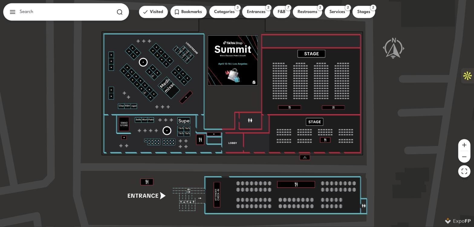
At TikTok Shop Summit, the entrance opens directly into a lobby with clear sightlines down two separate paths toward the stages and exhibitor pods, which prevents the single-chokepoint problem entirely.
2. Put anchor exhibitors and sponsors on the far wall, not by the door
Anchor exhibitors and key attractions can play an important role in how attendees move through an exhibition floor plan. Rather than placing every major sponsor or high-profile exhibitor directly at the entrance, consider positioning some of these destinations deeper within the exhibit hall to encourage visitors to move through more of the show floor.
Main stages, sponsor areas, networking spaces, and other high-interest features can also be positioned toward the center or rear of the hall. Used strategically, these anchor points can help draw attendee traffic past more exhibitor booths, improve visibility across different areas of the floor, and reduce congestion near the main entrance.
3. Use a loop, not a dead end
Aisle structure can have a significant impact on how attendees move through an exhibition floor plan. Wherever the venue layout allows, consider creating connected aisles or circulation loops that encourage visitors to continue through the show floor rather than reaching a dead end and turning back.
A loop-style layout can guide attendees past more exhibitor booths while providing multiple paths between entrances, exits, stages, and other key areas. Minimizing dead-end aisles can also make the exhibit hall easier to navigate and help distribute foot traffic more evenly across the floor.
4. Keep main aisles wide enough for two-way traffic and dwell time
Aisle width is a traffic-flow decision as much as a fire-code one. If a main aisle is barely wide enough for two people to pass, nobody will stop to talk to an exhibitor — they’ll keep walking to avoid blocking the path. Most convention centers set a minimum aisle width for fire egress (commonly in the 8–10 ft / 2.4–3 m range for main aisles, with cross-aisles sometimes allowed narrower), but that minimum is a floor, not a target. Give your busiest aisles extra width so people can stop, demo a product, and let others pass at the same time.
Always confirm exact minimums with your venue and local fire marshal — requirements vary by hall, occupancy load, and country, and this is one place where a design that “looks fine” on screen can fail an on-site inspection.
5. Vary booth types to break up visual monotony
A hall filled entirely with identical 10×10 ft (3×3 m) inline booths reads as one long wall from a distance, and attendees tune it out. Mixing in corner booths, peninsulas, and island booths at intervals — even a handful — breaks the sightline and gives attendees visual landmarks to navigate by (“meet me at the island booth near the food court”). If you’re not sure which booth type fits which spot on your plan, our guide to inline, corner, peninsula and island booths breaks down the tradeoffs, and our booth sizes and dimensions guide covers standard dimensions on both sides of the Atlantic.
6. Place Food, Restrooms, and Seating to Distribute Traffic
Amenities such as food areas, restrooms, charging stations, and lounges can influence how attendees move through an exhibition floor plan. Instead of concentrating these facilities near the entrance or in a single area, consider distributing them across different parts of the exhibit hall.
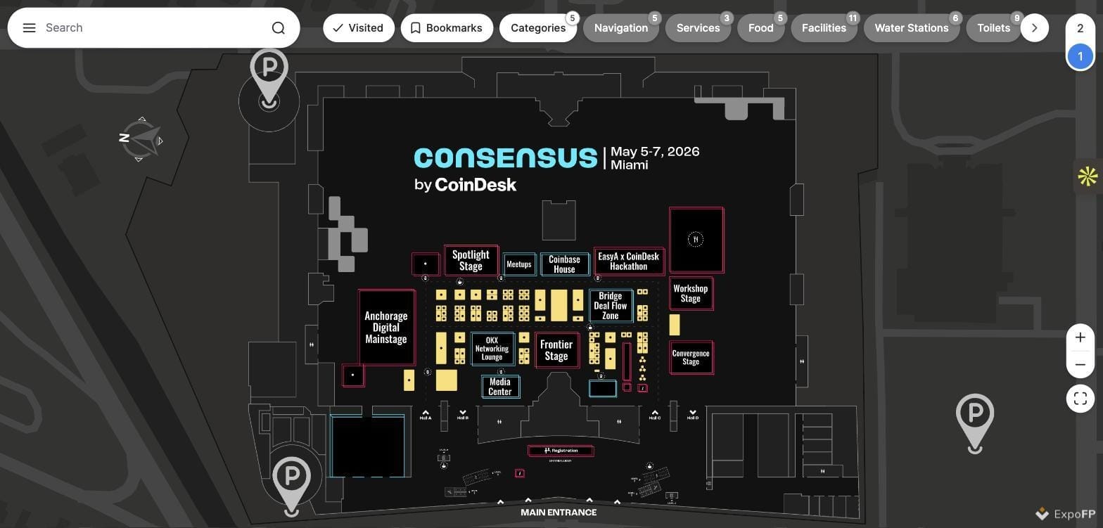
Consensus Miami illustrates this well: the show places its stages, meetup zones, and hackathon area around the interior of the hall, so getting from one program area to another means crossing active exhibitor space rather than a perimeter corridor.
7. Build in sightlines to your biggest visual landmarks
Attendees navigate by landmarks long before they navigate by booth number. A tall structure, branded stage backdrop, or oversized sponsor sign should be visible from multiple points in the hall, not boxed in by taller booths around it. When you’re laying out the plan, check what’s actually visible from each entrance and major intersection — not just what’s on the map, but what a 5’6" attendee will actually see over the crowd.
8. Design for wayfinding from the first sketch, not as an afterthought
Signage, digital kiosks, and a mobile-friendly interactive map work best when the underlying layout is already legible — clear zones, consistent numbering, and aisles that read left-to-right or in a predictable grid. Bolting wayfinding onto a chaotic layout after the fact never fully fixes the confusion. For a full framework on signage, digital maps, and on-site navigation, see our complete guide to event wayfinding.
An interactive floor plan also does double duty here: attendees can search for an exhibitor by name or category before they arrive, and the same plan becomes your wayfinding tool on-site — no separate app or printed map needed.
9. Respect venue-specific access, evacuation and column constraints
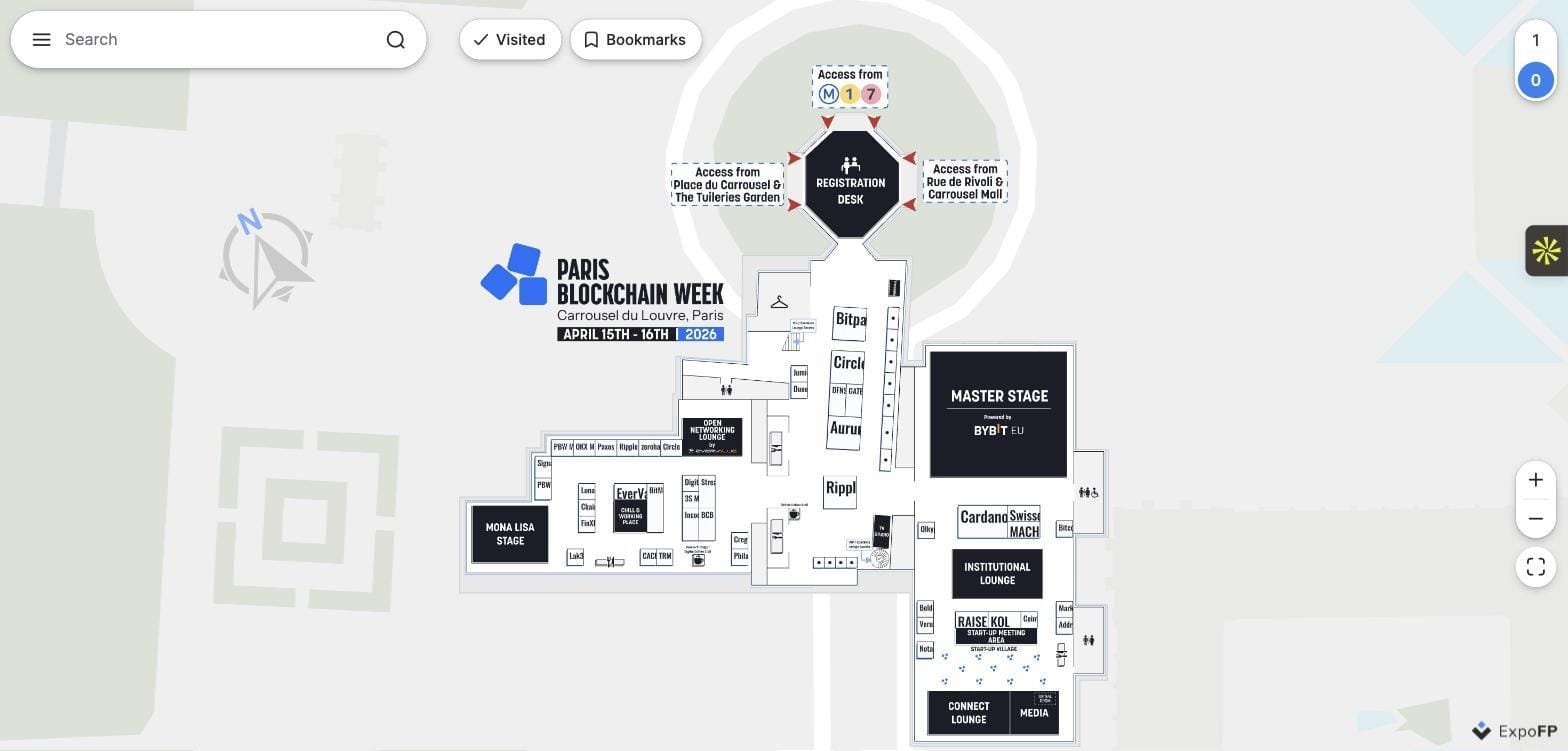
Every venue has physical constraints that override design preference: structural columns, low-clearance areas, loading dock access, and fire evacuation routes that must stay clear at all times. Paris Blockchain Week, hosted at the historic Carrousel du Louvre, works around a below-grade venue with fixed access points from the Métro, Place du Carrousel and Rue de Rivoli — the floor plan routes attendees from three separate entrances toward a single central registration desk, which is a very different challenge from a flat, column-free US convention center hall.
Always request a current CAD or PDF venue map with columns, doors, and code-required clearances marked before you finalize a layout — never design purely from a floor area figure.
10. Number booths in a system attendees can predict, not just one exhibitors can find
Booth numbering should let an attendee standing anywhere in the hall guess, roughly, which direction a given number is in — sequential by row, with hall or section prefixes for larger venues. A numbering scheme that jumps around (or restarts per sponsor tier) forces every attendee to stop and search rather than orient themselves. This matters as much for exhibitor satisfaction as for attendee experience: exhibitors judge your show partly by how easy it was for buyers to find them.
11. Leave circulation slack — don’t sell every square foot
It’s tempting to maximize revenue by selling booth space right up to the legal aisle minimum. In practice, a hall that’s “full” edge-to-edge feels cramped and attendees leave earlier. Leaving a little circulation slack — slightly wider aisles than the code minimum, a few open gathering points, breathing room around popular stages — increases dwell time, and dwell time is what exhibitors are actually paying for.
12. Test the plan digitally before it’s built
The cheapest time to catch a bad layout is before a single pipe-and-drape panel goes up. Building your floor plan in an interactive floor plan tool lets you walk the plan as an attendee would — zoom in, trace routes between two points, check what’s visible from the entrance — and adjust booth placement in minutes instead of re-drawing a CAD file. It also means the same layout you used to sell booths becomes the live map attendees use on-site, with search, categories, and directions built in. See how it works on the live demo floor plan, or browse venue examples to see how other organizers have laid out halls similar to yours.
Exhibition floor plan design checklist
- ☐ Entrance decompression zone mapped before booth rows
- ☐ Anchor exhibitors and main stage placed away from the entrance
- ☐ Aisles designed as loops, not dead ends, wherever possible
- ☐ Main aisle width confirmed against venue fire code (typically 8–10 ft / 2.4–3 m minimum)
- ☐ Booth type mix varied to break up long inline runs
- ☐ Amenities (food, restrooms, seating) distributed across 2–3 zones
- ☐ Sightlines to major landmarks checked from key intersections
- ☐ Numbering system is sequential and predictable
- ☐ Current venue CAD map reviewed for columns, doors, and code clearances
- ☐ Layout tested digitally as an attendee would experience it
Exhibition floor plan design: quick comparison
FAQ
What is exhibition floor plan design? Exhibition floor plan design is the process of arranging booths, aisles, stages, and amenities within a venue to maximize visitor traffic, exhibitor visibility, and attendee ease of navigation, while meeting fire code and accessibility requirements.
What is the minimum aisle width for a trade show? Minimum aisle widths are set by the venue and local fire code, not a universal standard — many US convention centers require at least 8–10 ft (2.4–3 m) for main aisles, with narrower allowances for some cross-aisles. Always confirm exact figures with your venue and fire marshal before finalizing a layout.
Should sponsor booths go near the entrance? Generally no. Placing anchor sponsors and main stages toward the back or center of the hall forces attendees to travel through more of the floor, which increases traffic for every exhibitor along the way — not just the sponsor.
How do I design a floor plan without CAD experience? Browser-based tools like ExpoFP’s Floor Plan Designer let you draw booths, aisles, and landmarks by dragging shapes rather than using CAD software, and the same layout becomes your live, searchable attendee map.
How many booth types should a floor plan use? There’s no fixed rule, but mixing at least two or three booth types (inline plus corner or island) across a hall of any size helps break up visual monotony and gives attendees landmarks to navigate by. See our booth types guide for how each type affects sightlines.
Ready to put these practices into a real layout? Create your floor plan free and see it live in minutes — no CAD software required.