
Trade Show Kiosks & Digital Signage: Buyer’s Guide
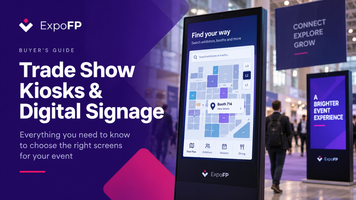
Trade show kiosks are free-standing screens placed throughout an event venue to help attendees search for exhibitors, find booths, and navigate the show floor. Digital signage can also be used to display event information, directions, schedules, promotions, and other content across the venue.
When planning kiosks and digital signage for a trade show, organizers need to consider factors such as screen size, placement, mounting options, software, accessibility, connectivity, and cost.
This guide covers the main considerations when choosing trade show kiosks and digital signage, with a focus on solutions used by event organizers throughout the venue rather than individual exhibitor booth displays.
Kiosks vs. digital signage: what’s the difference?
Although interactive kiosks and digital signage are both used throughout event venues, they serve different purposes. Understanding the difference can help organizers choose the right option for each location.
| Interactive kiosk | Digital signage (non-interactive) | |
|---|---|---|
| User interaction | Attendees can touch, search, and select information | Attendees view displayed information |
| Primary use | Navigation and information lookup | Displaying event information and announcements |
| Typical content | Interactive floor plan, exhibitor directory, wayfinding | Schedules, sponsor content, announcements |
| Placement | Entrances, hall intersections, and other navigation points | High-traffic areas, queues, escalators, and common areas |
| Content updates | Can display live floor plan and exhibitor data | Usually managed through scheduled content |
| Hardware | Touchscreen, computer/player, and enclosure | Screen and media player |
For trade show kiosks, interactive content is especially useful when attendees need to search for exhibitors, find booths, or get directions around the venue. A static map can still provide basic information, but an interactive floor plan allows attendees to search, explore, and navigate the event directly from the kiosk.
What to buy: hardware specifications
Screen size and orientation
The right kiosk screen size and orientation depends on how the screen will be used, where it will be placed, and how attendees will interact with it.
| Use case | Screen considerations | Orientation |
|---|---|---|
| Wayfinding / exhibitor directory | Large enough for comfortable touchscreen use | Portrait or landscape |
| Large venue floor plan | Larger display for viewing detailed maps | Landscape often works well |
| Registration / check-in | Smaller screen suitable for close interaction | Portrait or landscape |
| Schedule display | Large enough to display multiple sessions clearly | Landscape often works well |
| Sponsor content / digital signage | Size based on viewing distance and placement | Either |
For interactive trade show kiosks, choose an orientation that works well with your floor plan and interface. Landscape screens can provide more space for wide venue maps, while portrait screens may work well for exhibitor directories and other vertically structured content.
Screen placement and expected viewing distance should also be considered when selecting the display size.
Brightness
Screen brightness is an important consideration when choosing trade show kiosks and digital signage, especially in venues with different lighting conditions.
- Indoor halls with controlled lighting: Standard commercial displays are generally suitable.
- Atriums and areas with natural light: Higher-brightness displays can improve visibility.
- Outdoor or entrance areas: Displays designed for outdoor use may be required, along with appropriate weather-resistant enclosures.
Before selecting a display, consider the lighting conditions at each kiosk location. Areas near windows, glass entrances, or skylights may require brighter screens to keep maps and other event information easy to read.
Mounting types
Free-standing totems are the default for wayfinding because they can sit in the middle of a circulation space where the decision actually gets made. Wall mounts are cheaper but put the screen at the edge of the room, which is usually not where people are confused.
Touch technology
The right touch technology for a trade show kiosk depends on the screen size, location, and how attendees will interact with the display.
- PCAP (projected capacitive): Commonly used for interactive kiosks and touchscreens. It supports multi-touch gestures such as pinch-to-zoom, making it suitable for interactive floor plans and exhibitor directories.
- Infrared touch: Often used with larger displays and can be another option for indoor event kiosks. Consider the environment and hardware requirements when choosing between infrared and capacitive touch.
- Non-touch display with QR code: A screen can also display event information or a floor plan together with a QR code that attendees scan to open the interactive map on their own device.
QR codes can complement event kiosks by allowing attendees to continue using the interactive floor plan and wayfinding on their phones as they move around the venue.
Where to put them: placement rules
Placement determines whether kiosks get used far more than hardware quality does. Five rules:
1. Put kiosks at decision points, not at destinations. A kiosk beside the hall you are already standing in answers a question nobody is asking. Kiosks belong where a visitor has to choose a direction: entrance lobbies, hall junctions, escalator landings, the top of a concourse where three halls branch.
2. Face them into the traffic flow. A screen perpendicular to the walking direction gets seen; a screen parallel to it gets walked past. Sketch the flow arrows on your floor plan before you place a single unit.
3. Leave approach space. Allow at least 1.2 m (4 ft) of clear floor in front of each kiosk so a user can stand and read without blocking the aisle. In practice, budget a 1.5 × 1.5 m (5 × 5 ft) footprint per kiosk including approach.
4. Cluster at the entrance, spread through the halls. Entrances need two or three kiosks side by side, because that is where demand spikes and queues form. Interior placements should be single units at 60–100 m intervals along main aisles.
5. Never place a kiosk where it blocks egress. Emergency exit routes and aisle widths are regulated and enforced by the venue and local fire authority. Kiosk positions go on the plan you submit for approval — not added on move-in day. Confirm required aisle clearances with your venue and local fire marshal, as they vary by jurisdiction.
How many kiosks?
There is no universal ratio, and any vendor who gives you one without seeing your floor plan is guessing. Anchor on geometry instead:
- One cluster of 2–3 units at each main entrance.
- One unit at each hall entrance or major junction.
- One unit per 60–100 m of main aisle in halls over about 10,000 m².
- One unit at each registration area and each major amenity cluster (food court, lounges).
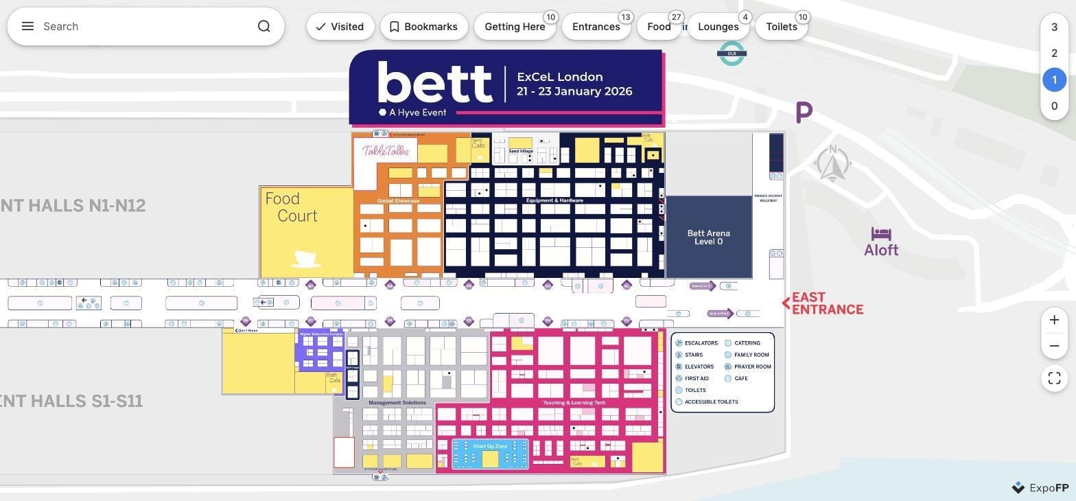
For a mid-size show in a single 15,000 m² hall, that typically lands around 6–10 units. For a multi-hall show at a venue like RAI Amsterdam or ExCeL London, it climbs into the dozens. Model it on your plan, count the decision points, then add 15% for the ones you missed.
Accessibility: the ranges to design to
Accessibility is where kiosk projects most often get sent back after installation. Design to it upfront.
Common design targets, based on the US ADA Standards for Accessible Design and widely used as a baseline internationally:
Practically, this means the interactive portion of a portrait kiosk should sit in a band roughly 900–1,200 mm off the floor. A 55-in portrait screen mounted so its top edge is at eye height will place its lower controls below reach range and its upper controls above it. The usual solution is to make the entire screen interactive but duplicate all critical controls into the accessible band — search box, zoom, category filters at hand height, decorative branding above.
Also plan for:
- Text contrast of at least 4.5:1 for body text against background.
- Minimum touch target of about 44 × 44 px, larger in practice for gloved or unsteady hands.
- Screen glare control — a matte or anti-glare finish, or the wheelchair-height view becomes a reflection of the ceiling lights.
- A non-screen fallback: printed maps at the help desk and a QR handoff to mobile.
Requirements vary by country and venue. In the EU, the European Accessibility Act brings self-service terminals into scope; confirm the specific obligations with your venue and legal counsel rather than assuming a single standard applies everywhere.
Software: what the kiosk actually needs to run
Hardware is the easy part. The software requirements that separate a used kiosk from an ignored one:
Must have
- Search that returns a location. Typing an exhibitor name should highlight the booth on the map, not open a text entry.
- Live data. The kiosk should reflect the same exhibitor list as your website. Booths move, exhibitors cancel, and a kiosk showing last month’s data destroys trust in every screen at the show.
- Category and amenity filters. “Show me all robotics exhibitors” and “where is the nearest toilet” are the two highest-frequency queries at almost every show.
- Idle reset. If a visitor walks away mid-search, the kiosk must return to the home view within 30–60 seconds. Nothing kills usage faster than approaching a screen already zoomed into someone else’s booth.
- Offline resilience. Venue Wi-Fi fails. The plan should be cached locally and keep working when the network drops.
- QR handoff. A code that transfers the current view — including the route the visitor just looked up — to their phone.
Nice to have
- Route drawing between the kiosk’s own “you are here” position and the selected booth.
- Multi-language toggle. Essential at international shows; Global Industrie, Metstrade and similar events draw visitors from dozens of countries.
- Sponsor slots in the idle-state loop and around the map frame — a real revenue line, covered below.
- Usage analytics. Which booths get searched, which zones get zoomed. This data is genuinely valuable at rebooking time.
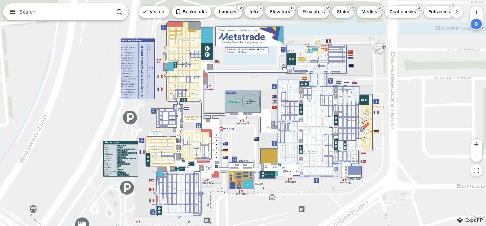
The Metstrade plan illustrates the point precisely: a visitor cannot read 1,500 booths on a screen. What they can do is type “Norwegian Pavilion” and have the map take them there. Your kiosk software either supports that interaction or it does not, and no screen size compensates.
If your floor plan is currently a CAD export or a PDF, that has to change before kiosks make sense — see what an interactive floor plan actually is for the data model this depends on.
Budget lines organizers forget
The screen is rarely the biggest number. The lines that surprise people:
Rent or buy? Rent if you run one or two shows a year, or if your venue changes. Buy if you run a recurring show at a permanent venue and can amortise across editions — but factor in storage, transport and the fact that panel technology and enclosure branding both date within a few years.
Kiosks as a revenue stream
Digital signage is one of the easier sponsorship inventories to sell because it is measurable and non-intrusive.
- Kiosk idle-state takeover — a sponsor’s creative fills the screen between users. Priced by unit-count and show-days.
- Map frame branding — a persistent banner around the floor plan view.
- Featured booth highlighting — sponsored exhibitors rendered in a distinct colour with a pin icon, on both kiosk and mobile.
- Category sponsorship — “Robotics zone, presented by X” appearing whenever the filter is applied.
- Wayfinding route sponsorship — a light-touch logo on the drawn route.
The advantage over printed signage is that you can report impressions and interactions. Fold these into your rate card alongside other digital assets — see our guide to event sponsorship packages and pricing for how to tier them.
Pre-show kiosk checklist
12 weeks out
- ☐ Kiosk positions marked on the floor plan, submitted with the venue’s fire and safety plan
- ☐ Power and network drops ordered from the venue (deadline pricing applies)
- ☐ Hardware spec locked: sizes, orientation, brightness, mounting type
- ☐ Accessibility review of mounting heights and clear floor space
6 weeks out
- ☐ Kiosk content layout built and reviewed at actual screen size, not on a laptop
- ☐ Sponsor creative deadlines communicated
- ☐ Exhibitor data feed connected and syncing to the floor plan
- ☐ Idle timeout, home view and reset behaviour configured
2 weeks out
- ☐ Full dress rehearsal of the kiosk view with final exhibitor data
- ☐ Offline mode tested by disconnecting the network
- ☐ QR handoff tested on iOS and Android
- ☐ Multi-language versions proofread by native speakers
Move-in day
- ☐ Every unit powered, connected and showing the correct home view
- ☐ Positions verified against the approved plan — not moved by the build crew
- ☐ Brightness checked at the hour your doors open, with venue lighting as it will be
- ☐ Cable covers secured, no trip hazards
- ☐ Screens cleaned; wipes stocked at each unit
- ☐ Tech support rota posted with unit-by-unit assignments
During show
- ☐ Morning check of all units before doors
- ☐ Mid-day screen cleaning pass
- ☐ Usage analytics reviewed nightly to spot dead units and dead placements
Fold these milestones into your broader trade show planning timeline so the venue deadlines do not catch you out.
Common failure modes
The kiosk shows a picture, not a map. No search, no zoom, no filter. Attendees touch it once, nothing happens, and they never touch another one all show.
The data is stale. Booth moves after the kiosk content was built. One wrong booth teaches attendees to distrust every screen.
Placement follows power outlets. Screens end up wherever the venue happened to put a floor box, which is almost never a decision point. Order the power to the position you want, not the other way round.
No “you are here.” A map without an anchor point is a puzzle. Every kiosk must know and display its own location — which requires the kiosk’s position to be a data field on the plan, set during configuration.
Landscape content on a portrait screen. A wide hall map letterboxed into a portrait frame wastes 60% of the display. Decide orientation from the content, then buy.
Nobody owns the kiosks on site. Units go dark, freeze on error screens, or get moved by a forklift, and nobody notices for a day. Assign a named owner with a rota.
Most of these trace back to treating kiosks as a hardware purchase rather than a wayfinding decision. The screens are a delivery mechanism; the underlying plan is the product. Our event wayfinding guide covers how kiosks fit alongside static signage and mobile, and the floor plan design best practices piece covers making a plan that survives being shown at three metres.
Create your floor plan free → — build once, deploy the same interactive plan to kiosks, your website and attendees’ phones.
FAQ
What is a trade show kiosk?
A free-standing screen placed around an event venue that lets attendees search exhibitors, locate booths and find amenities without asking staff. Most are interactive touchscreens running a searchable floor plan; some are non-interactive displays paired with a QR code that hands the interactive version to the visitor’s phone.
How many kiosks does a trade show need?
It depends on floor geometry rather than attendance. A reasonable model: 2–3 units clustered at each main entrance, one at each hall entrance or major junction, one per 60–100 m of main aisle in large halls, plus one at each registration area and amenity cluster. A single-hall 15,000 m² show typically needs 6–10; a multi-hall international show needs dozens.
What size screen should an event wayfinding kiosk be?
43–55 inches in portrait orientation is the standard for wayfinding directories — it matches standing sightline and displays exhibitor lists well. Use 55–75 inches in landscape if the primary content is a wide, full-hall floor plan, since most exhibition halls are wider than they are deep.
Do trade show kiosks need to be ADA compliant?
In the United States, self-service kiosks at public accommodations are generally expected to meet ADA reach ranges — operable controls within 380–1,220 mm (15–48 in) of the floor, with adequate clear floor space and knee clearance. In the EU, the European Accessibility Act brings self-service terminals into scope. Requirements vary by jurisdiction and venue, so confirm the specific obligations with your venue and legal counsel during planning rather than at install.
Can I use QR codes instead of interactive kiosks?
Yes, and often you should. A printed or displayed “you are here” panel with a QR code delivers the interactive map to the visitor’s own phone at a fraction of the hardware cost, eliminates kiosk queues, removes touch-hygiene concerns, and lets the visitor keep the map as they walk. Many organizers run a hybrid: interactive kiosks at entrances where demand concentrates, QR panels throughout the halls.
What is the difference between digital signage and an interactive kiosk?
Digital signage broadcasts — schedules, announcements, sponsor loops — and the attendee reads it in three to eight seconds. An interactive kiosk responds: the attendee searches, filters and zooms, typically for 20–90 seconds. They serve different jobs, sit in different places, and should be budgeted as separate line items.
How do I stop kiosk content going out of date during a show?
Connect the kiosk to the same live floor plan data your website and mobile map use, rather than exporting a static image for the screens. When a booth moves or an exhibitor cancels, the change propagates everywhere at once. Consistent booth numbering across all three surfaces is what makes that reliable.